We Fight Any Claim
A claims management company who were struggling with a brand that felt aggressive and didn’t install the sense of security and trust customers needed to feel.

Making a brand less aggressive
When I joined Premiumstar Ltd, the brand had quite an aggressive feel to it, having fight in the name, an alarming orange colour palette and a large use of the image of boxer Joe Calzaghe. As a financial services company the brand needed to be more approachable and trusting.
I re-structured the logo, toned down the orange and made the brand primarily blue and white. While I wasn’t permitted to remove the images of Joe, I scaled them down, used them less, and had new images taken where he looked more relaxed and calm. I also changed the font to something rounded, yet bold.
I carried out work on the customer claim pack. The changes made the documents easier to print and easier for the customer to fill out. I introduced an address window into the cover keeping the impact of the cover sitting the address letter inside. The changes also cut costs by 3.6%.


Web & digital marketing
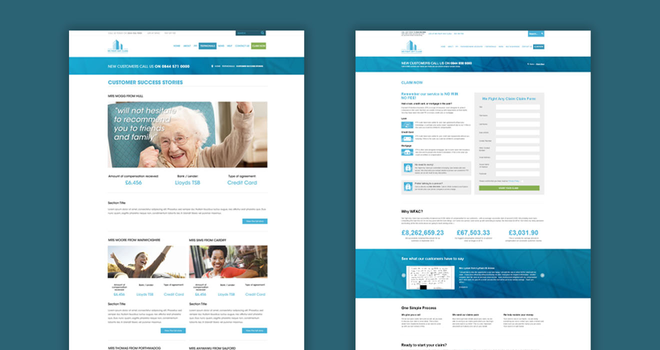
After the re-brand I re-built the website. Keeping the same clean blue look, and introducing a brand green to use for positive call to actions. I spent a lot of time gathering data on, and refining, the online claim form to improve the experience and journey of an online customer. This included building a full online claim form to significantly reduce the volume of physical forms filled out by the customer.
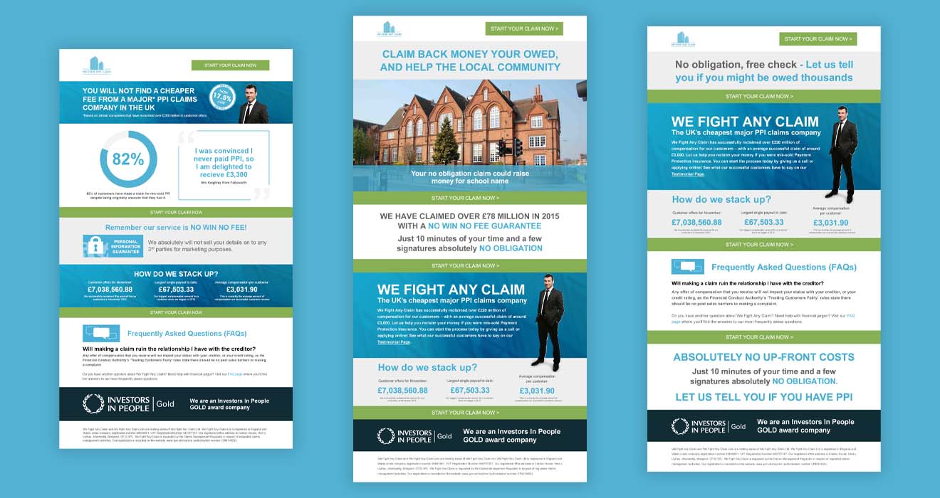
Following the new website there was a focus on many digital campaigns that included email, PPC, and social activities.


More Projects

