DevOpsGroup
A tech professional services company who were struggling with brand consistency. They needed a brand that engaged with its customers, helped position them as thought-leaders, and attracted talent in a competitive industry.

A brand that tells stories
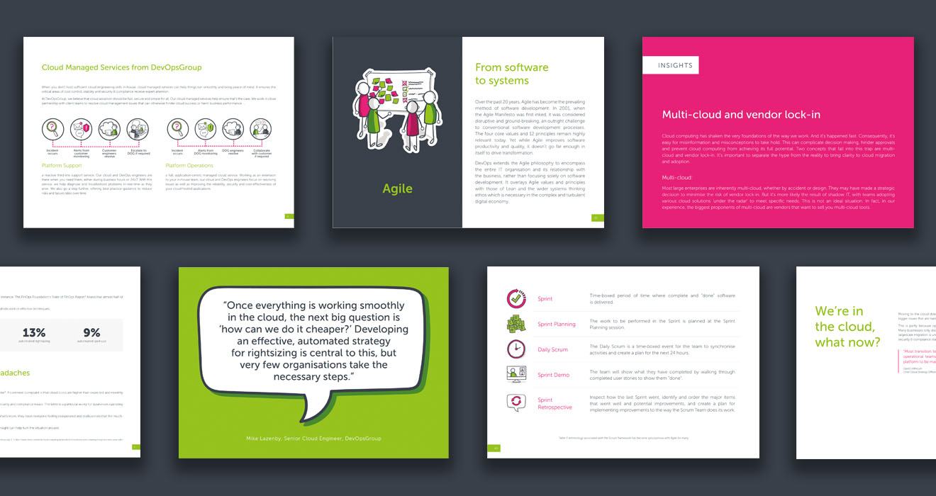
When I joined DevOpsGroup the brand was incoherent and lacked consistency. There were also elements that didn’t work together. I overhauled the brand, giving everything a new look that would position it as an established and confident competitor in the UK tech scene.
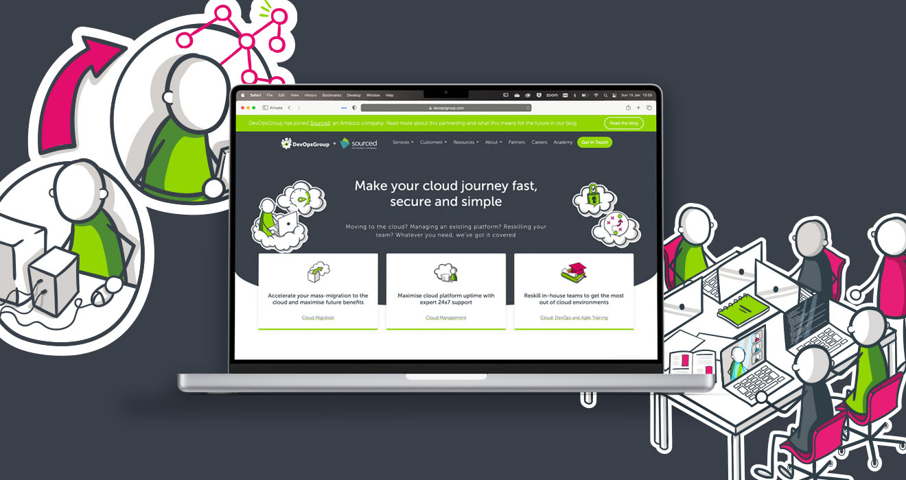
A key part of the visual brand was illustration. A fun, playful style that stood out amongst the competitors capturing a lot of attention. The true purpose of the illustrations was to allow the brand to focus on storytelling. We were able to take complicated technical concepts and distill them down to fun and simple illustrations, diagrams, and animations. These have been really admired within the tech scene and have even been used by Amazon Web Services (AWS) and Microsoft.


Putting people first
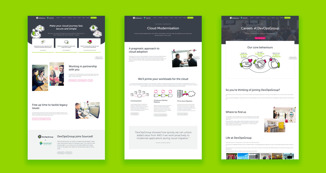
With such a bright illustration-heavy brand, the photography needed to compliment that style. As a consultancy it was also important to show that we work with our clients like a part of the team. I wanted imagery that showed our people enjoying working and collaborating. It was critical to be authentic and human, showing modern approaches to work, rather than using images of servers and circuitboards.


Keeping the brand professional
The brand needed to strike a balance between the vibrant colour palette with distinct illustrations and a quieter, more serene side. DOG needed to fit in the boardrooms of the big corporate enterprises that we were working with. In order to keep a balance the rest of the brand needed to be kept clean and simple, with plenty of whitespace.


Going digital
For the website, I stuck with the clean approach of the brand and increased the use of photography to give users something real to connect with. I also made use of the illustrations as SVGs, animating them to bring impact or interest where needed.
View DevOpsGroup Website Screen Recording


More Projects
